In this article, I’m going to share the templates I’ve created for studying Japanese. There are four in total..
LEER (READING), ESCRIBIR (WRITING), DE_KANA (FROM_KANA), and A_KANA (TO_KANA).
This section was traslated by AI and is still under revision. Second Part and Third Part of this article still aren’t avaliable in English.
Updates: When there are updates or new templates, I will use this box to notify you. If you happen to lose the link to this blog or this article, you can find it below the templates (see image).
The text is the same color as the background and has no links to avoid distractions during reviews, but you should still be able to select it.
Next, I’ll explain the features of the template, but if you prefer, you can skip directly to the next part to start with the installation.
Template Functions
Although there are four templates, it doesn’t mean they are limited to just four functions. To illustrate, I’ll show you how I use them.
- READING: I use it for vocabulary, grammar/expressions that use kanji, and for my deck of individual kanji.
- FROM_KANA: I primarily use it for grammar, expressions, vocabulary without kanji, etc.
- TO_KANA: I don’t use it myself, but I’m publishing it just in case it becomes necessary.
- WRITING: Initially, it’s meant for handwriting. I don’t write much, but it’s a very useful card.
General Features
Fields
The cards have many fields, so it can be overwhelming at first if you’re not used to it. However, it’s likely that you’ll need each of them at some point.
For example, I try to use as few fields as possible because filling out everything requires extra time and effort for each word, but I do use them when needed or when I feel like it.

Explanation of the Fields
Some fields are self-explanatory.
- Palabra (Word): It’s always the word, but with some nuances. In READING and WRITING, it would be 漢字, in TO_KANA and FROM_KANA, it would be かんじ.
- Why don’t I use the Hiragana field in TO_KANA and FROM_KANA?: Because this way, Yomichan can detect the cards even if they belong to a different card type than your configured one.
- If you don’t like switching card types, you’ll have to make some adjustments, but you can perfectly use only the READING template and use the Word field for everything.
Further down in the diagram section, I’ll explain a small adjustment you might want to apply in this case. Using only READING also has disadvantages; for example, one of them is explained in the Audio section.
-
Hiragana: It’s called that, but it’s actually for writing the word’s reading in hiragana or katakana.
-
Alternativas (Alternatives): If the word has other forms of writing or pronunciation, you can indicate them here. They will be less prominent than the main one but right below it.
-
Significado (Meaning): Non-Japanese meaning, although you can also highlight a Japanese meaning if you prefer.
-
Significado Japonés (Japanese Meaning): It appears in a stylish white box, which looks really nice.
-
Notas Visibles (Visible Notes): I use it to display notes on the front. For example, when a word has multiple pronunciations, you can specify which one the card refers to with a hint.
-
Frases Visibles y Frases (Visible Sentences and Sentences): There are two fields because sometimes you’ll want the sentences to be visible on the front and other times not.
-
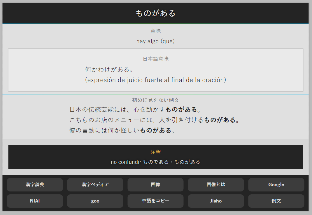
No Confundir (Don’t Confuse): I added this field because it was information I used to add to notes and it bothered me. I like the Notes field to be independent. It’s only visible on the back and is used to put something like “昨日・昨今” on both cards, so if you confuse one word with another, you can easily find both using the search.
-
Notas (Notes): This field is for everything you need related to the word that doesn’t fit in any other field.
- Audio: This field is more interesting than it seems. With programs like Yomichan, you can add word pronunciations to the cards, and depending on the card type, this audio will be heard on the front or back.
- READING: Heard on the back.
- WRITING: Heard on the front, and it’s very helpful to know what you need to write.
- FROM_KANA: Heard on the front, as these cards typically require you to remember the meaning.
- TO_KANA: Heard on the back.
-
Imagenes (Images): This field is for images to have their own section. I used to use the Notes field for this, but it was very inconvenient when I wanted to add annotations as well. It centers the text by default and tries to arrange the images horizontally if they fit, but you can always add line breaks.
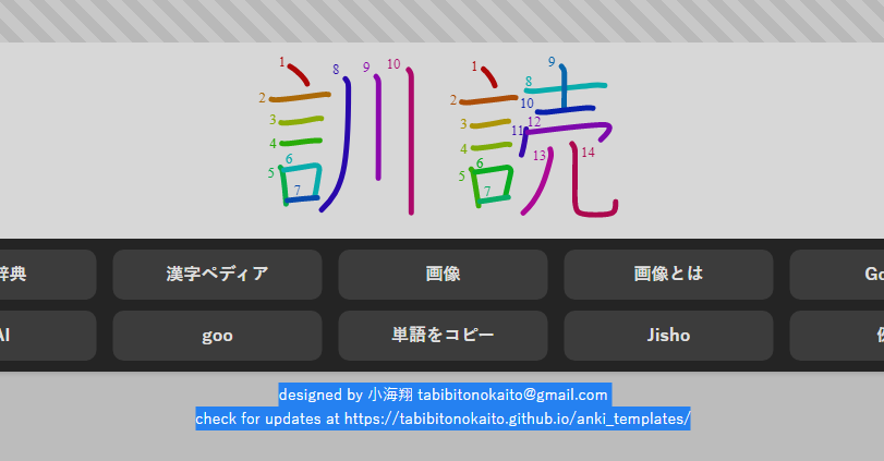
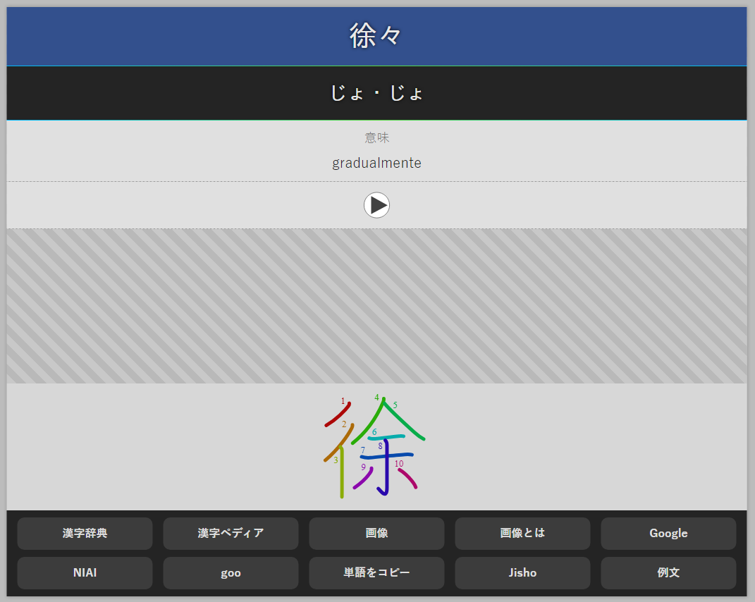
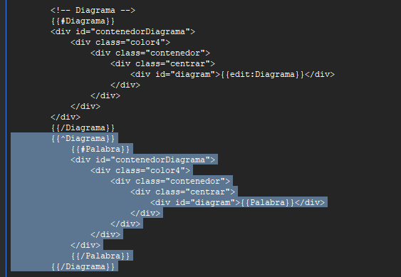
- Diagrama (Diagram): You can use fancy plugins like Kanji Colorizer (stroke order diagrams) to add the stroke order of kanji. In case you don’t add anything, the stroke order will still appear with a special font.
Adjustment if you’re only going to use the READ template as a replacement for FROM_KANA: If you’re annoyed that the Diagram field generates the stroke order for word cards that don’t use kanji (like すんな), you can disable this function yourself, just remember to copy the code you’re going to edit to a notepad in case you break something:
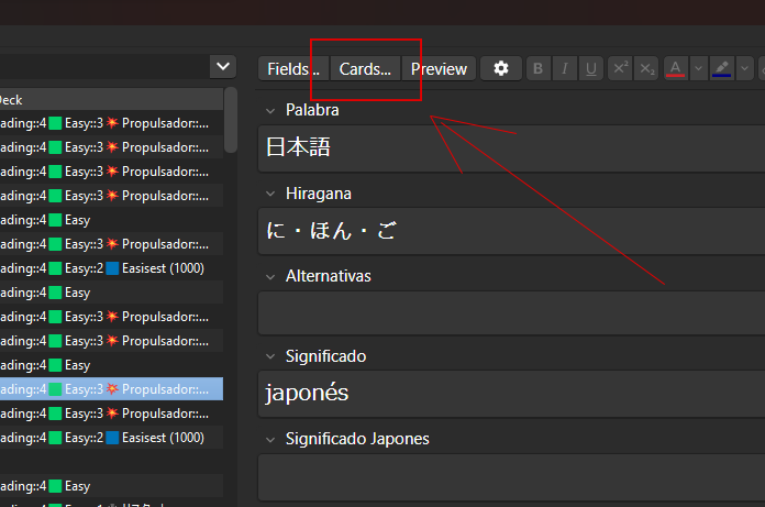
In the Anki search bar, find any card that uses the READING template. Above the fields, you’ll see a button labeled “Cards” (image1). Click on it, and you’ll see the template code.
You need to edit the Back Template and remove the part that is between {{^Diagrama}} and {{/Diagrama}} (image2). Then, simply save the changes.
- Hidden Content: Just like “No Confundir,” this field is a hidden gem. By default, the field is hidden and is used to place anything you don’t want to be visible directly.
- You can use it to store information that doesn’t fit into the other fields.
- You can also save content you don’t want others to see, such as personal information. This will allow you, for example, to stream without revealing information you prefer to keep private.
- Another use case would be if you want to share some cards but not all of their content. You’ll know exactly where to find what you don’t want to share.
I’m sure you’ll find it very useful.
Note: The Hiragana and Diagrama fields are also included in the FROM_KANA and TO_KANA templates but are not visible during reviews (they are minimized below the other fields).
The reasons for this are security and convenience. If you accidentally change the card type from, for example, READING to FROM_KANA, you won’t lose any information. Simply converting the cards back to READING will allow you to revert the changes.
Extended Features
I’ve included some additional very interesting features in the templates that I’ll explain below:
- Quick Access Buttons to various dictionaries and image searches (available in all templates).
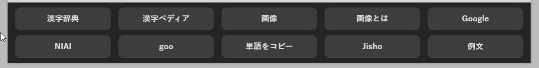
Suppose the word was 瀞, you can click with the mouse wheel on the following links to see how the buttons would work:
Suppose the word was 瀞, you can click with the mouse wheel on the following links to see how the buttons would work:
- 漢字辞典 (usually for kanji) useful for kanken
- 漢字ペディア (usually for kanji) useful for kanken
- 画像 search for images
- 画像とは search for images with とは (emphasizes the meaning)
- Google search with とは on Google (to find out what it means)
- NIAI search for kanji that are similar due to using the same radicals (useful for kanken)
- goo if you like goo, you can access it directly
- 単語をコピー: copy the word
- Jisho you already know this one
-
例文 Google search for example sentences (の例文)
- Image Brightness Reduction Filter: even though the template is almost white, images with completely white backgrounds were still annoying to the eye, but this problem is now solved. If you want to see the image in its original color, you can hover the mouse pointer over it.
-
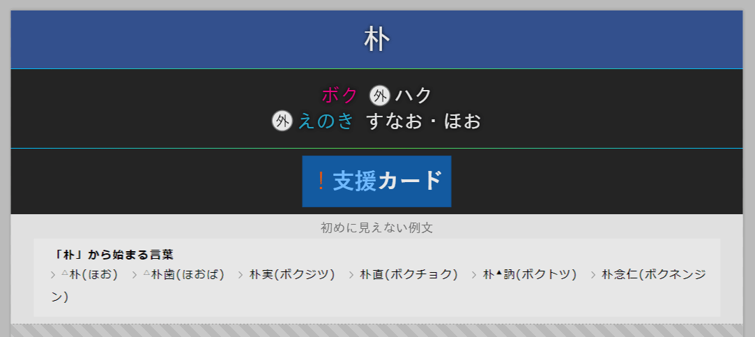
Predefined Styles for the Hiragana Field (also the image above). You can use bold, subscript, etc., to apply predefined styles to the hiragana field. This is perfect for individual kanji cards.
-
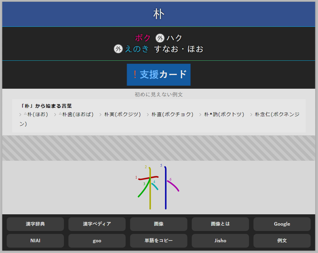
Images: they have an automatic size defined by CSS to fit the text, pushing the text only slightly (2px) to the right. In the image, you can see 外, which specifies readings that are outside of kanken.
-
Superscript: turns the text orange. I use it to specify that it’s a reading I’ve only seen in names.
-
Subscript: turns the text a less prominent red color. I use it to indicate readings that belong to the kanji but aren’t found anywhere, not in words, names, or anything else, they only appear in dictionaries.
-
Underline: turns the text blue. The reading doesn’t appear in the dictionary but is still used.
-
Bold: turns the text pink. It’s a common use reading 常用漢字.
-
Italic: darkens the text regardless of its color, for example, to highlight that a reading fits within the kanji. Example: 食べる (たべる).
-
Note: You can deactivate predefined styles by adding the class “no” to each element (using the HTML editor).
In future versions, I’ll improve the predefined styles so that they can be deactivated more conveniently and also activated in any other field besides hiragana.
- BLUR: as if the Hidden Content field wasn’t enough, this is another system for hiding content.
- Applies a blur effect to your images/text or any HTML element or group of elements.
- Click on the blurred element to toggle blur on<->off.
-
Choose how much the content is blurred from a wide range of degrees.
- How to use it?
- Add a parent div (<div class=”blur CLASE_2”>) that contains the image or, in general, any HTML element or group of elements to which you want to apply an initial blur.
- CLASE: instead of CLASE, choose a secondary class from n h hh hhh hhhh hhhhh x xx xxx xxxx xxxxx, depending on how powerful you want the blur to be.
The following code will hide both the image and the text, and by clicking on either of them, both will be displayed (because they are within the same parent div). The text should be intangible (because even with a little blur, text becomes unreadable), but the image will only appear slightly blurry.
  <div class="blur n">
      My Hidden Image<br>
      <img src="my_image.png">
  </div>
Notes:
The blur divs are inline elements, so if they fit, they will be placed next to each other. If you want a line break between two blur elements, you’ll have to add a <br>.
Blur hides content directly but can be easily reversed by AI, so use Hidden Content if you really don’t want something to be visible.
- Semi-Included Functions (installed separately from the template but configured)
-
Main Font: The main font for Word is configured to look the same on any device (even if the font is not installed).
-
Font for Stroke Order: If you don’t use an add-on to create images with stroke order like the mentioned Kanji Colorizer (stroke order diagrams), you can still see the stroke order on LEER and ESCRIBIR card types (on any device as well).
If you don’t see the strokes for a kanji, it’s probably because it doesn’t belong to the kanken, and even if you use Kanji Colorizer, you probably wouldn’t get the stroke order.
-
For the rest of the fonts, the font will depend on the system you run Anki on, but it shouldn’t be a problem since where it’s really annoying is in the Palabra field. Also, it should look virtually the same with the chosen fonts.
Why hasn’t it been configured to make fonts look the same on all devices?
The reason is that loading fonts slows down card loading during reviews (as a detail, adding large images also slows down card loading).
On my mobile phone with these two I’ve chosen, I have almost no latency, but adding a third one is a problem. My phone is not very good, but that makes it a good standard because if it works well on my phone, it should work well on the average phone, it has an old phone as well, it should work well on that too.
I could also use the Palabra font for everything, but the truth is that this font looks very good in that field but not in the others, and the same happens in reverse.
Anyway, in future versions, I’ll include an optimization so that everything goes through Javascript first and I’ll make sure that what needs to be seen quickly is shown quickly, but sections like Images or Diagram will appear as quickly as possible but afterward. In addition, all fonts will be included to avoid depending on the operating system.